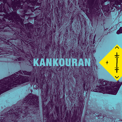
Album Artwork and Digi-packs are more important than they first appear. As much as many people don't agree with the phrase 'Don't judge a book by its cover', people still do a majority of the time, it promotes the artist & people are often drawn in by the design on the cover.
The original album artwork for Kankouran is this:
It is a clever piece of artwork for their CD, Kankouran is a type of African dance and it features an African tribe symbol in yellow on the right of the cover, this being an obvious influence to the artwork. The tree involved in the dance is what they dress as when they perform the dance. it has great meaning behind it. It uses simple font, it co-ordinates with the other use of colour in the picture and fits together as a piece of art. Using a filter of colour in this artwork makes it look colder however contrasting with the yellow allows the attention/focus to be on the symbol, ultimately appealing to their individual audience. However with the targeted audience, piecing the puzzle together & the links between the name of the band and the artwork will not be instant, it will take time and genuine interest in the band for that link to be found.
I would rate this artwork 8/10
A band that I consider has a similar sound to parts of the Kankouran track is a band called 'Bleeding Knees Club' (BKC) and in particular a track/ single called 'Same Game'. This is their album artwork:
The image that BKC portray from their attire is a skater boy image, baggy shirts, skinny jeans, vans, white socks, beanie/cap hats. This is reflected in their album artwork, the vans, skateboard and white socks are mounted on a paving stone with the album name on it in a graffiti-esq style, which could have been influenced by a band that they consider one of their main influences, a band called 'Nirvana'. In particular a piece of graffiti with the name of their best-selling album - featured above. Both pictures have been washed out to create an old-style feeling to it. It is a relaxed image, it doesn't make you feel uncomfortable as an audience, it's a calm picture, indicating the tracks will be similar.
I would rate this artwork 7/10
The next sound I consider similar is produced and created by a local band called 'The Cads'. They use synthesisers, in a similar way that Kankouran do, this is what links their sounds together. This is their album artwork:
This was designed by one of the band members,
Stefan Vincent, he is studying graphic design at university and creates prints and collages which are very innovative. This piece is based on symmetry, the colours are kept simple, much like the font. The complex design could be kept made looking simple because of the choice of colours, making it visually pleasing. This is an original piece of work meaning it probably doesn't have a big influence. It defines the unique aspect of the band, also somewhat justifying their sound.
I would rate this artwork 7/10
A band called 'Wolf Gang' are the band that also have the futuristic style of sound. This is their album artwork:

Their sound has a beat that picks up pace in particular a song called 'Dancing With the Devil', and has the same structure as 'Rivers' by 'Kankouran', with similar meaning as well, it is an uplifting song but yet has a dark message about making a deal with the devil. The artwork has low saturation meaning there is wash of little colour but not quite black and white. It is similar artwork to 'Language - Zulu Winter' and 'Family' - 'The Cast of Cheers'.
By involving an isolated person, it means that their young audience can relate to being alone, and possibly elements of being apart or separate, maybe feeling like they don't fit in somewhere, this is shown through the unique style the subject in the picture shows wearing the headdress. It exercises elements of exploring and finding new things through the location shown on the cover. This is something that all teenagers (their target audience) experience, whether it be themselves, a passion, or a style. (as an example) In those terms, it is a very representative piece of album artwork.
I would rate this artwork 6/10
'ODD BLOOD' by 'Yeasayer' is a very unique piece of artwork for a cover of a CD case and unlike anything I've seen before, also the sound they produce is somewhat similar in my opinion to 'Kankouran':
In my opinion this isn't a very inspiring piece of artwork, it is in fact slightly confusing and not quite understandable. It is a graphically enhanced piece of work and is quite pixelated. (assuming that is on purpose) Their target audience as a band would be similar to Kankouran as it is a similar style of music, and the current zeitgeist is to be an individual and have your own style which this image suggests. It is unlike any other album artwork I have seen and owned and it is a truly unique piece. However, as much as this is an individual piece of cover work, it doesn't suggest what to expect from the album. The highly pixelated background could suggest that it becomes an electro album including many synthesisers but how can the audience know that? Personally I am not impressed with the album artwork and if I was judging what I bought on the way it looked, I would not buy this.
I would rate this artwork 3/10
'Chairlift' are a band that are again, similar to Kankouran. However their artwork is one of the most simple from the selection I have picked;
The simplicity of the design by Chairlift is most effective, by colour co-ordinating their clothes to the frame of the picture featured, it keeps the attention on the band themselves. The frame features maybe ripples in a sandy area, possibly a desert, with noise a what looks like crumpled of screwed up paper layered over the top t give a vintage effect on the cover work. This suggests that the band have a vintage like feel to their music, possibly inspired by some artists who are now vintage to their audience, this message is also portrayed from the way that they are dressed, in vintage style, tea-dress attire. Possibly those in their audience who have an interest in the vintage era, may give this band a listen. However their music tell otherwise, it is electro pop-esp and a alternative to 'indie' music. Despite the misleading artwork, this is one of my favourite covers and will take that into consideration when planning my cover artwork/digi-pack.
I would rate this artwork 9/10
The nest piece of cover work is by a band called 'Of Monsters and Men' (OMAM);
The image of the beach that is featured in this album artwork is the main focus of this piece, despite the main subject being the male character in the picture. The beach is the location and when you look at the picture, it makes you feel relaxed and calm, almost suggesting that is what you should expect the album to be like, in this case, it is a relaxed album and the cover work reflects the general sound of OMAM. Young people (16-25) are most likely this band's target audience, and young people see the beach as a place of holidaying, to rest and unwind, this image is very fitting to those feelings. Despite it not being the most exciting piece of artwork, it sends the message of the sound of their music to the audience clearly and is a peaceful and visually pleasing image to have on the front of their CD.
I would rate this artwork 8/10.
'The Naked and Famous' (TNAF) album cover for 'Passive Me, Aggressive You' is a colourful and visually challenging image;
It challenges your opinion on what the image actually is of, at first glance, obviously, the world but there is no recognisable pattern of the continents on the globe shape, however what they have done is layer alternate images over what could initially have started off as being planet earth. The image has been placed onto hills and a rocky mountain which could be representative of where the female vocalist is from: New Zealand. The image portrays the band personally and reaches a new level in terms of their fans accessing information bout the band members they may not have known otherwise. It is a controversial image that represents their unusual collective sound. The colours used are bold and eye catching again ideal for attracting more of their target audience. (16-25)
I would rate this artwork 7/10
In conclusion, using controversial images like the Yeasayer image for promoting a band like Kankouran via Digi-packs is not a good way of engaging with the audience. Using something that the audience can relate to have emotional attachment to is key, that is what will make people pick it off the shelf and possibly give it a listen, it is also directly targeting the band's target audience.